
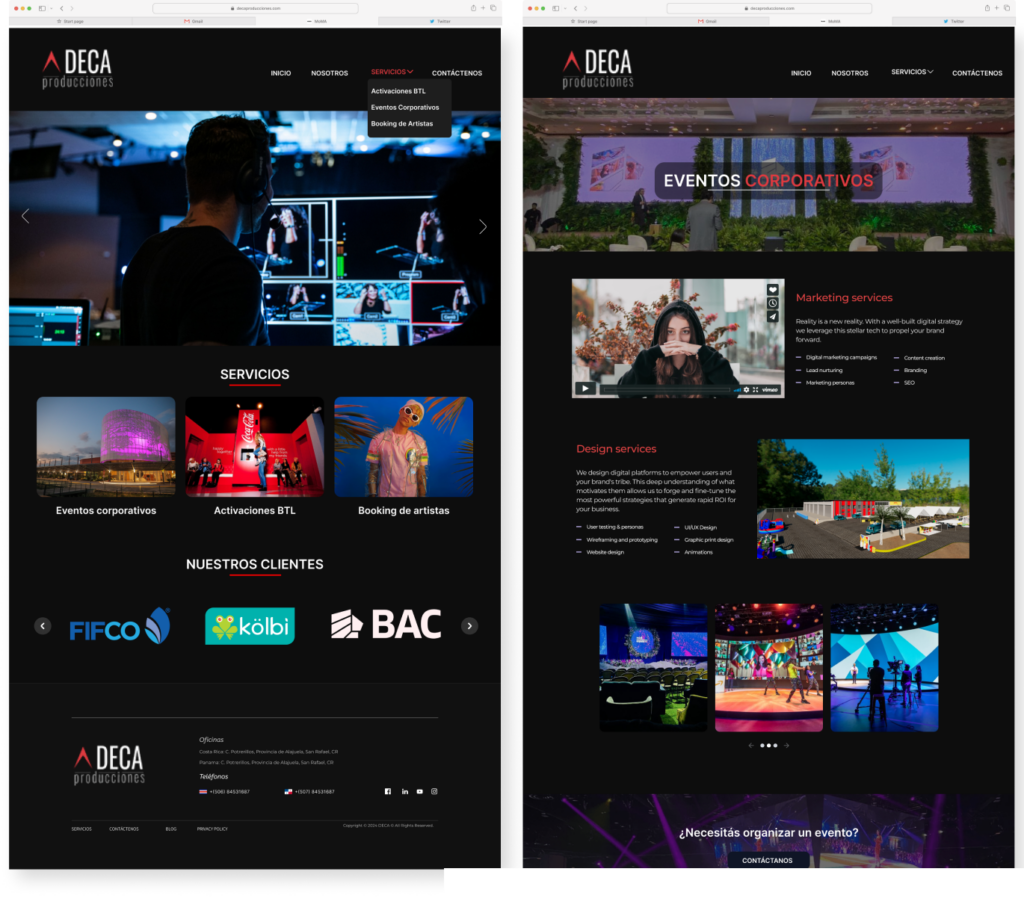
The project focuses on the conceptualization of a new website for Deca Producciones, with the primary goal of significantly enhancing the user experience on the Deca Producciones website. Using the Double Diamond methodology as the guiding design framework, the process is divided into four stages: Discover, Define, Develop, and Deliver.

Project Overview
- Project Duration: 3 months (Feb 2024 – April 2024)
- Team: Solo project
- Tools Used:Figma
The Problem
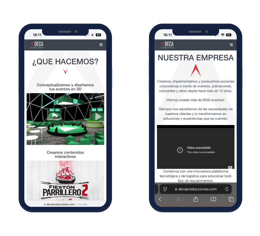
The identified issue lies in the current limitations of the existing website, which noticeably impact the user experience. Navigation is unintuitive, the interface does not fully align with contemporary expectations, and the digital interaction fails to effectively reflect the dynamic essence of Deca Producciones.
Quantitative Research
These are some of the questions posed to individuals aged 30 to 50 during the quantitative research. The results show how many people agree with them.
71%
86%
78%
95%
75%
90%
Pain Points
- Outdated information

- Lack of key information

- Complicated Navigation

- Visual design issues

Wireframes
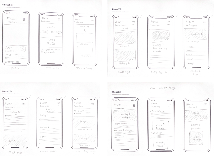
The low-fidelity paper wireframes created for the new Deca Producciones website consist of simple and rudimentary visual sketches that represent the structure and layout of key page elements. These include sections such as the header with the logo and navigation bar, the main content area with blocks of text and placeholder images, and the footer with contact information and additional links.
Paper Wireframes
As a UX designer, I believe it’s important to create paper wireframes to get a basic idea of the construction process and examine the architecture in a simple and quick way. Once defined and approved by the client, I like to refine these designs digitally using Figma.
Prototyping a solution
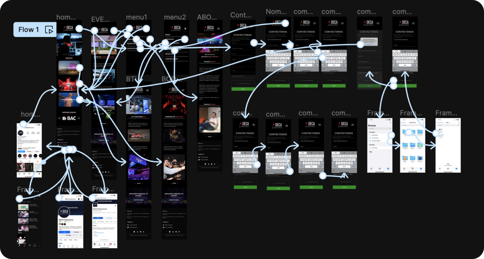
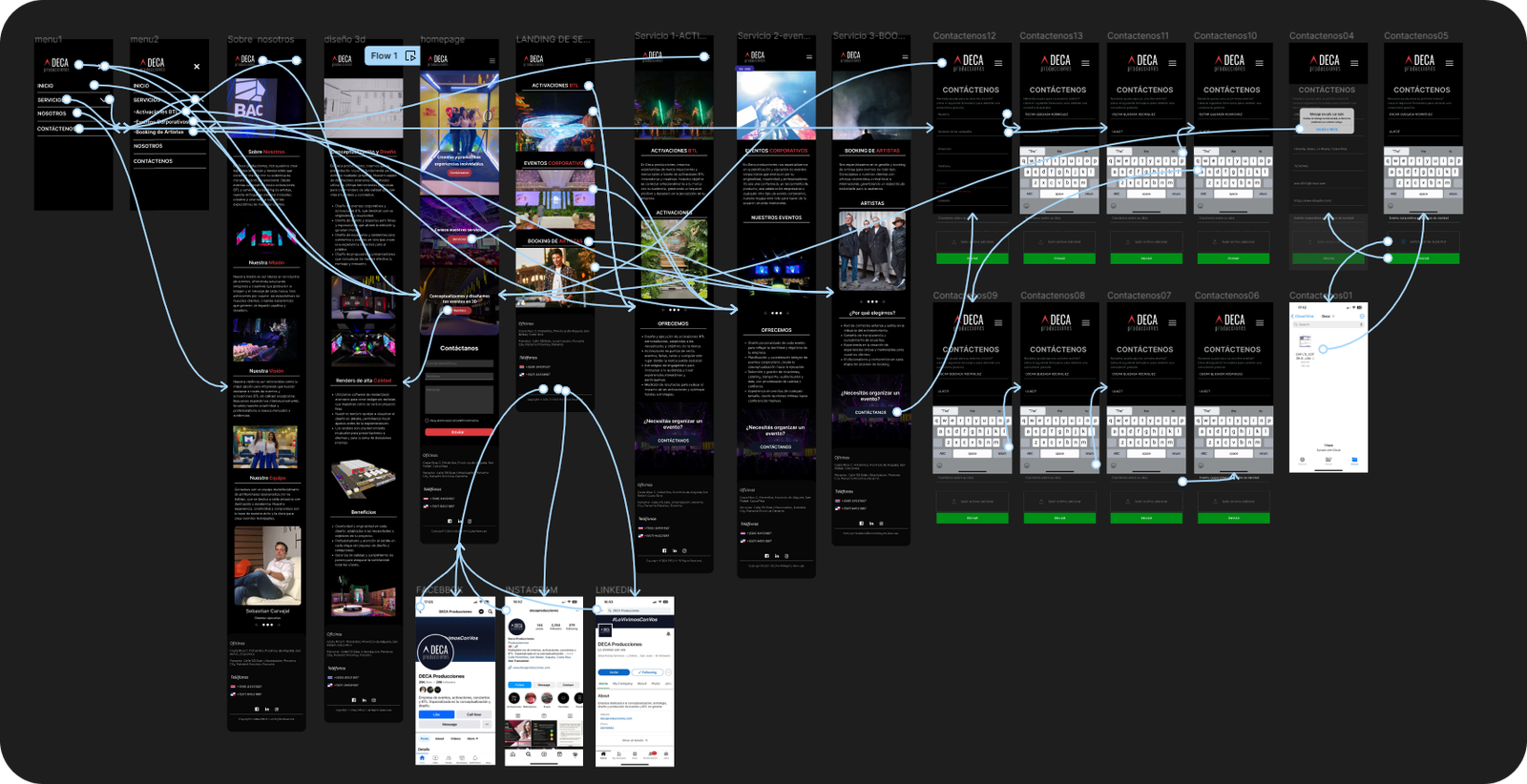
I developed a low-fidelity prototype using Figma. The prototype served as a foundation for conducting user testing to determine how easily users can contact Deca and whether the services offered by the brand are immediately clear.
Usability testing (Phase One)
The initial usability study aimed to evaluate the low-fidelity prototype developed in Figma. The study focused on two primary objectives:
- Ease of Contact:
Assessing how easily users could locate and use the contact section to get in touch with Deca Producciones. - Service Clarity:
Determining whether users could clearly understand the services offered by the brand upon first interaction with the prototype.
Participants from the target demographic were observed interacting with the prototype, and their feedback provided valuable insights to improve the design and enhance the user experience in subsequent iterations.
With nine participants from diverse backgrounds, ages, genders, and skill levels, I conducted the first round of usability studies. This initial usability study revealed that the mechanism used for users to get in touch was ineffective and did not meet the desired functionality. Only 22.2% of users completed the task successfully, 11.1% did not finish the task, and 41% had an incorrect click rate.
Findings
- Difficulty Contacting from Service Pages:
Users found it challenging to get in touch directly from the service pages. - Overloaded Homepage:
The homepage contains too much information, leading to user confusion. - Lack of Engagement:
The website feels static and unengaging, with a noticeable lack of dynamic elements.
High-Fidelity Prototype
Usability testing (Phase Two)
With nine participants from diverse backgrounds, ages, genders, and skill levels, I conducted the second round of usability studies. This new study achieved the desired results:
- 100% of users successfully completed the task directly.
- The incorrect click rate dropped to 33.3%.
- The average time to complete tasks was reduced to 15.2 seconds.
These improvements highlight the effectiveness of the design changes implemented based on feedback from the first usability study.
Outcome
The redesign of Deca Producciones website successfully addressed the usability challenges identified in the initial phases. Key achievements include:
- Enhanced User Experience:
- A 100% success rate for users completing tasks directly, demonstrating significant improvements in navigation and accessibility.
- A reduction in task completion time to an average of 15.2 seconds, showcasing increased efficiency.
- Improved Design and Engagement:
- A visually appealing, dynamic, and intuitive interface that aligns with modern design standards and user expectations.
- Clear and concise content organization, eliminating confusion and making the website more user-friendly.
- Client Satisfaction:
- The final high-fidelity prototype and usability improvements met client approval, effectively representing the brand’s dynamic essence and functionality.
The project outcomes underscore a user-centered approach that not only meets business goals but also provides a seamless and engaging experience for its audience.